
Eltropy Brand Hub
Making something with Eltropy's name on it? Start here. You'll find our logos, templates, the words we use, and how to put it all together. We've approved everything, so you don't need to check with us first. If something's missing, ask in #brand_questions and we'll do our best to help.
01
Logos
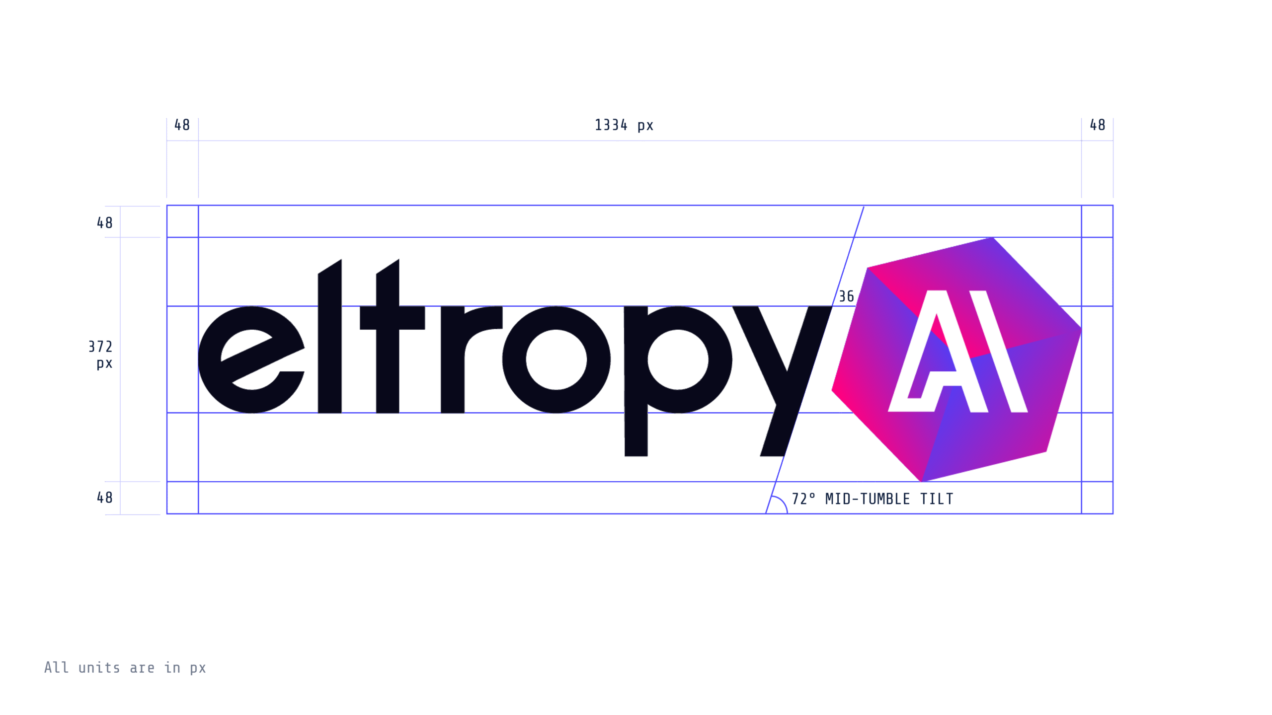
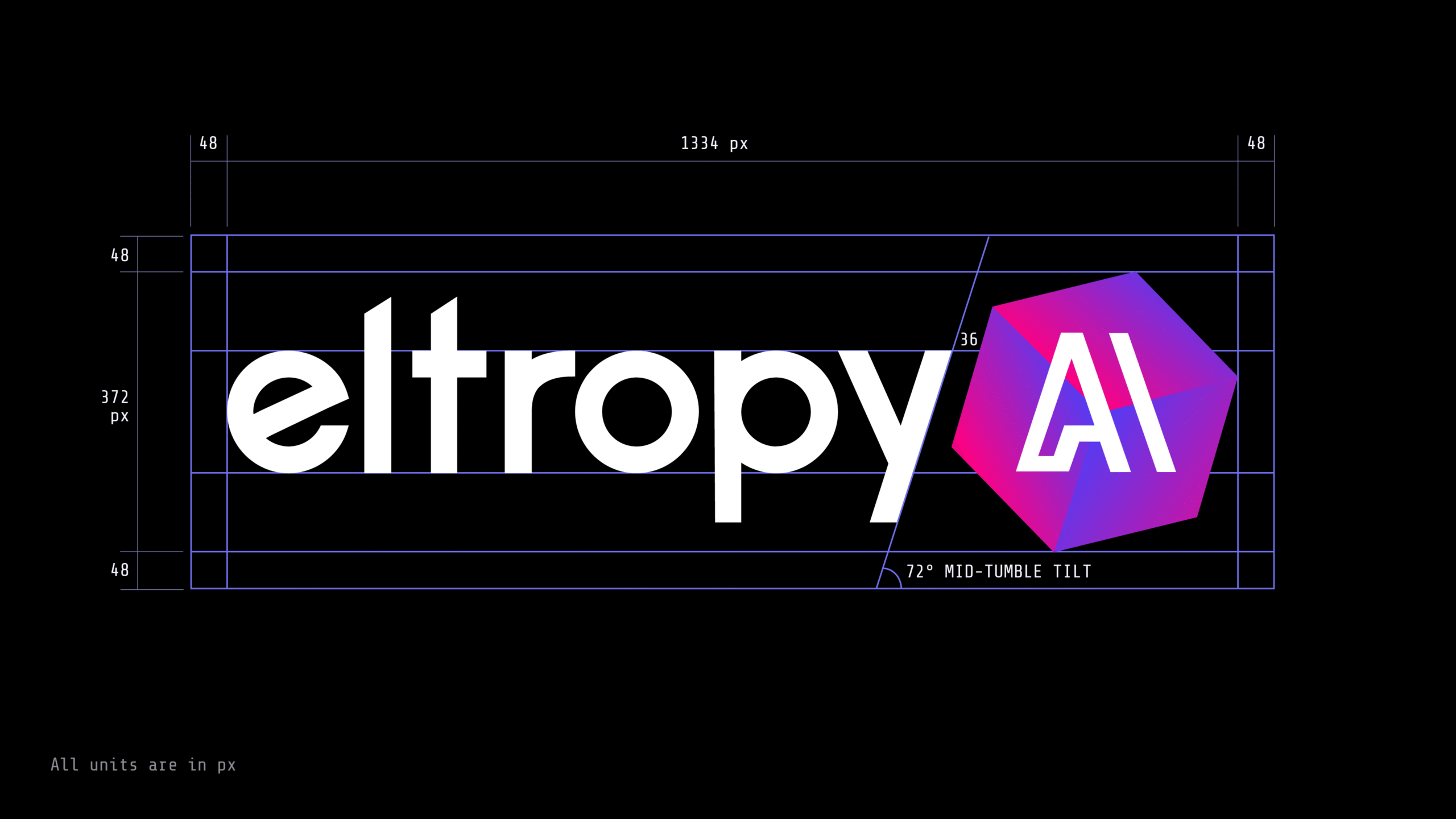
Nine times out of ten, you want the dark wordmark with the gradient AI hexagon on white. Use a light version on a dark background. For slides and documents, take the PNG. The SVG is for print.
How to use it
- Give it room.Keep empty space around the logo at least as tall as the "e" in eltropy. More space is always fine; less isn't.
- Don't change it.No rotating, stretching, recolouring, outlines, shadows, or effects. The hexagon is always the gradient or one flat colour, never a different gradient.
- Pairing with another logo?Use the full eltropy AI logo, make both logos the same height, and separate them with a thin vertical line.
- No room for the full logo?Use the Eltropy icon, the hexagon with the e. The AI hexagon is part of the logo and never stands on its own.
02
Templates
Start here before you build anything from scratch. Every template is already in the right fonts, colours, and logo.
Need a template that isn't here? Post in #brand_questions. We'd rather build it once than fix it five times.
03
Colour
Indigo does most of the work, so start there. Use Magenta when something needs to stand out. Solar Gold is our one accent, and it only goes on dark backgrounds because it washes out on white. Everything else comes from the neutrals. When you need a dark background, pick Midnight over black.
Brand colours
Neutrals
Text goes on Midnight or White. Frost is for slides where pure white feels harsh.
The gradient
Indigo to magenta at 135°, indigo in the bottom-left. Download the gradient files from Templates rather than rebuilding it. Never put text on top of it.
04
Typography
Poppins for headlines. Inter Tight for everything else.
Poppins
DownloadPage titles, section headlines, sub-headlines, and card titles, at H3 size or larger. Keep it light: Regular for section headlines, Medium for hero and sub-headlines, SemiBold only for the accent word in a headline. Never body text.
One platform. Every conversation.
Inter Tight
DownloadBody copy, buttons, labels, navigation, tables, forms, captions, and any heading smaller than H3. SemiBold for buttons and labels.
More than 750 credit unions and community banks use Eltropy today to grow, give members a better experience, and get more done with the teams they already have.
Getting the fonts
- Google Slides and Docs: both are already in the font menu. Search "Inter Tight" and "Poppins."
- PowerPoint and Word: download both families with the buttons above, install the files, then restart the app.
- Somewhere you can't install fonts? Use Arial for both. Don't swap in a different display face for Poppins.
05
For designers & developers
Building for web or product? These are the specs behind the brand system. Everyone else can stop here.
Colour spectrum
Each brand colour has a tint and shade ramp from 50 to 900. Use tints for hover states, backgrounds, and contrast relief on light surfaces. Use shades for emphasis on light surfaces. The full ramps are in the token export.
| Colour | Hex | RGB | HSL | OKLCH |
|---|
Gradient
Indigo #4541FE to magenta #FF0080 at 135°, interpolated in OKLCH. OKLCH keeps the lightness ramp even. sRGB dips to a dull purple in the middle, HSL overshoots into a violet brighter than either end.
Author only the two endpoints. The export generates the intermediate stops and an sRGB fallback for older browsers.
#4541FE → #FF0080 · 135° · interpolated in OKLCH · midpoint #B723DD
- Angle135°, bottom-left to top-right
- DirectionIndigo before magenta, never reversed
- StopsTwo. Don't add more.
- TextNever on the gradient. Solid colour for anything readable.
Type scale
Canonical web scale, 16px base. Round to whole pixels in production. Rem values are in the token export.
| Element | Family | Size | Weight | Line-height | Tracking | Use |
|---|
Web standards
- Spacing follows an 8px grid: 8, 12, 16, 24, 32, 48, 64.
- Weights: 300 for display accents, 400 for body and section headlines, 500 for hero, sub-headlines, and card titles, 600 for buttons, labels, small display type, and the accent word in a headline. Never 600 on body text or on a full headline.
- Line-height is locked per element in the scale above. Don't override it.
- Tracking: negative on Poppins headlines, neutral on Inter Tight body, +0.08em minimum on all-caps.
- All-caps is for labels and eyebrows only. Never body text.
- Minimum text size is 12px. 11px only for non-critical metadata.
- Body measure stays between 45 and 75 characters. Use
max-width: 65ch. - Mobile: H1 scales from 64px to 36px. Use
clamp(). Never go below the minimums.
Contrast
WCAG 2.1 AA: 4.5:1 for text under 24px, 3:1 for larger text and UI elements. The full table recalculates if a token changes.
What passes in practice
- On Midnight: White, Frost, Solar Gold, and Magenta pass for all text. Indigo passes for large text only.
- On White: Indigo, Black, Graphite, Slate, and Steel pass for all text. Magenta passes for large text only. Solar Gold fails.
| Foreground | On Midnight | On White |
|---|
Export tokens
Colour, spectrum, typography, gradient, and spacing tokens as CSS custom properties, JSON, or SCSS.